Statistical Methods
Table of Contents
Summarising data
data distribution: we want to know what the data looks like
a good summary needs to show location, spread, range, extremes, gaps/holes, symmetry, etc.
Graphical summaries
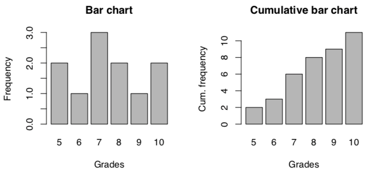
Frequency distribution (table)
| Grade | Frequency |
|---|---|
| 5 | 2 |
| 6 | 1 |
| 7 | 3 |
| 8 | 2 |
| 9 | 1 |
| 10 | 2 |
Bar chart
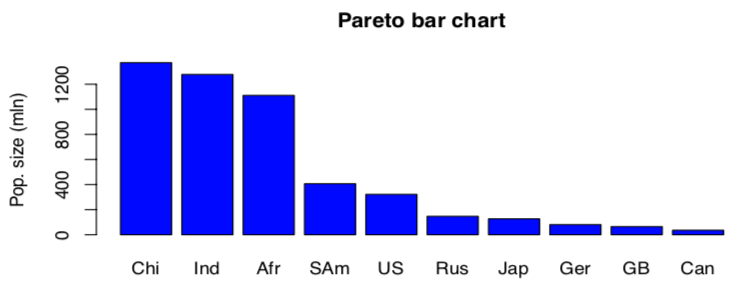
Pareto bar chart
orders categories based on frequency. only for nominal level of measurement
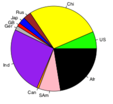
Pie chart
size of pieces of pie shows frequency of category.
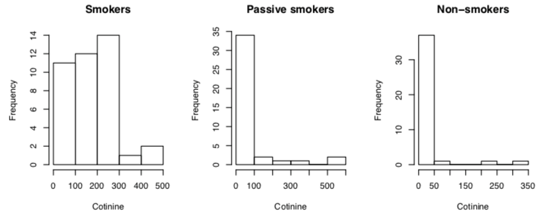
Histogram
size of bar shows frequency of that category.
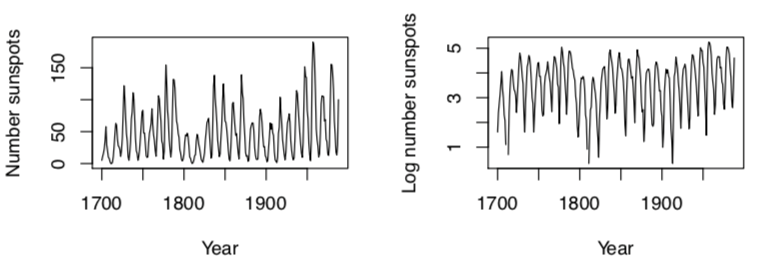
Time series
shows quantity that varies over time.
Descriptive summaries
qualitative description:
-
shape:
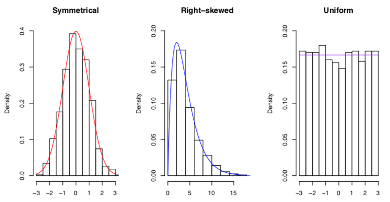
-
location: position on x axis (around 0, around 10, etc.)
-
dispersion: spread out graph == large dispersion
numerical description:
- location: measure of center
- mean: average (sum everything, divide by the total number)
- median: sort, find the middle number
- mode: most often occurring value (highest frequency)
- unimodal: unique mode
- bimodal: two modes
- multimodal: more than two modes
- dispersion:
- measures of variation
- sample standard deviation (how much values deviate from mean)
- same units as data (unlike variance)
- standard deviation is $\sqrt{s^{2}}$
- $s^{2} = \frac{\sum_{i=1} n(x_{i} - \bar{x}^{2})}{n-1}$
- for population: σ², σ
- range
- (minimum - maximum)
- sensitive to extreme values
- sample standard deviation (how much values deviate from mean)
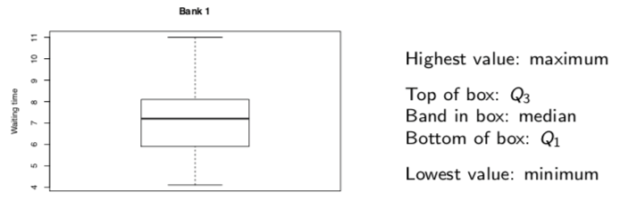
- relative standing
- percentiles, quartiles (special percentiles: Q1, Q2 (median), Q3)
- IQR: interquartile range = (Q3 - Q1)
- 5-number summary: min, Q1, median (Q2), Q3, max
- boxplot is graph of this
- whiskers are lines from box (by default, not more than 1.5 × IQR
- outliers: points outside of whiskers
- measures of variation